MTA unveils new NYC subway map for the first time in nearly 50 years — but straphangers aren’t thrilled: ‘This map sucks’
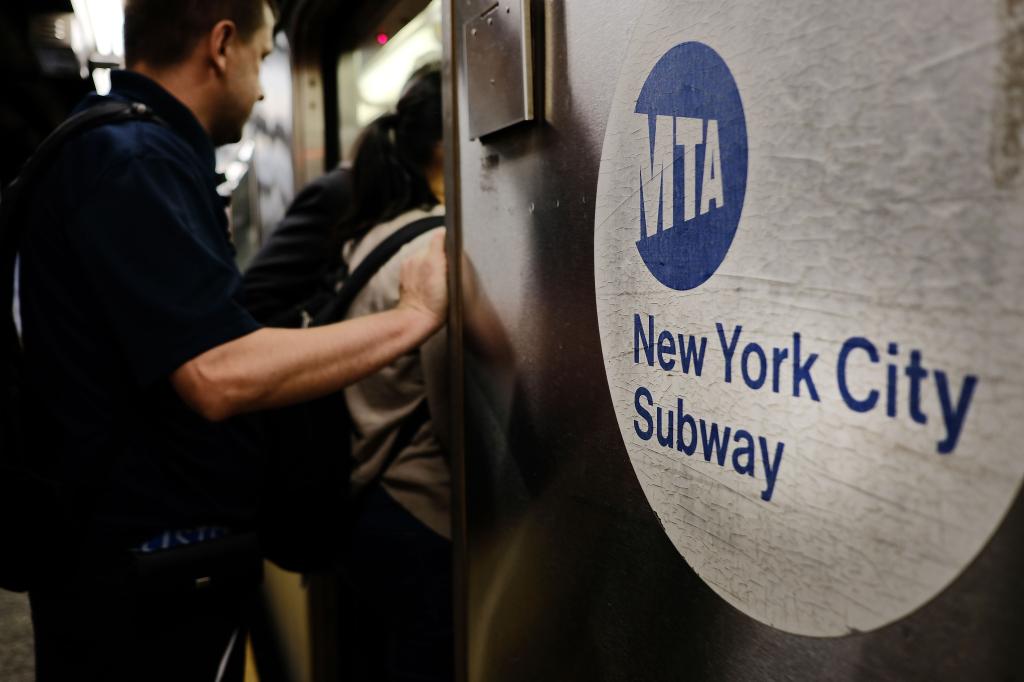
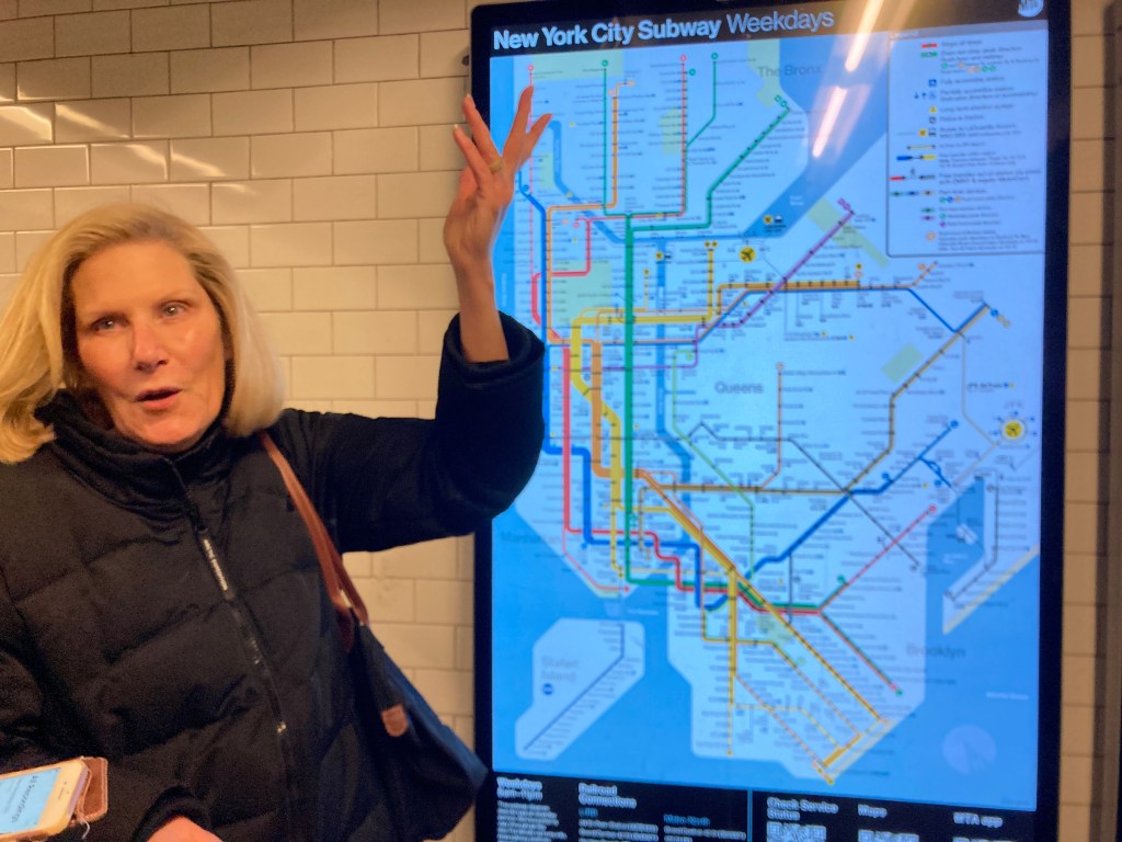
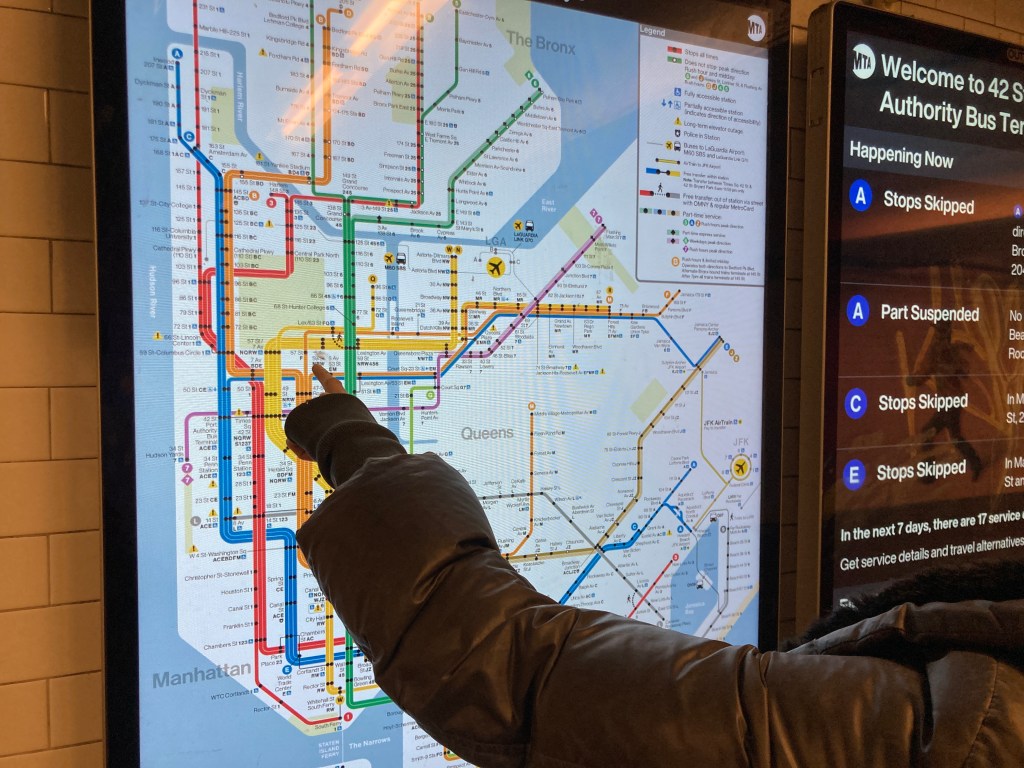
The MTA on Wednesday unveiled a new “easily readable” New York City subway map for the first time in nearly 50 years �?but straphangers knocked the redesigned graphic as a “complicated” brain teaser and a “waste of money” by the embattled agency.
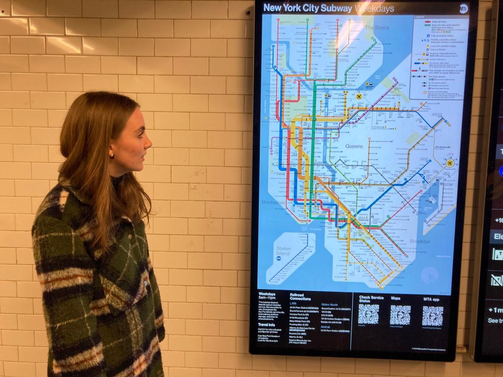
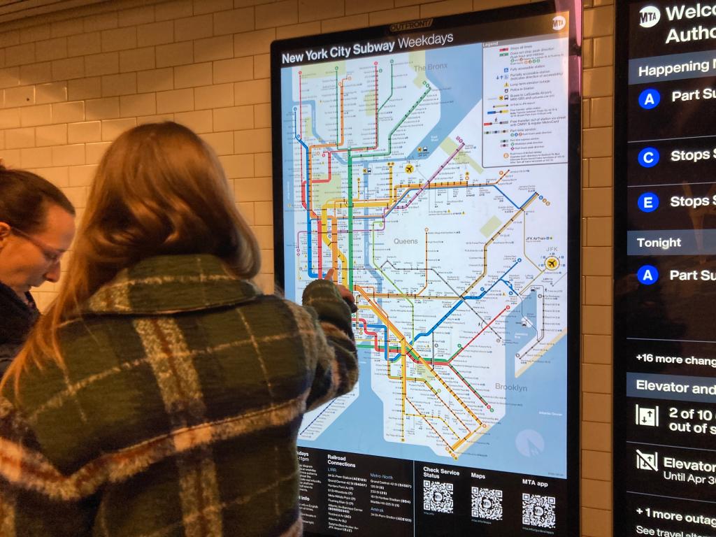
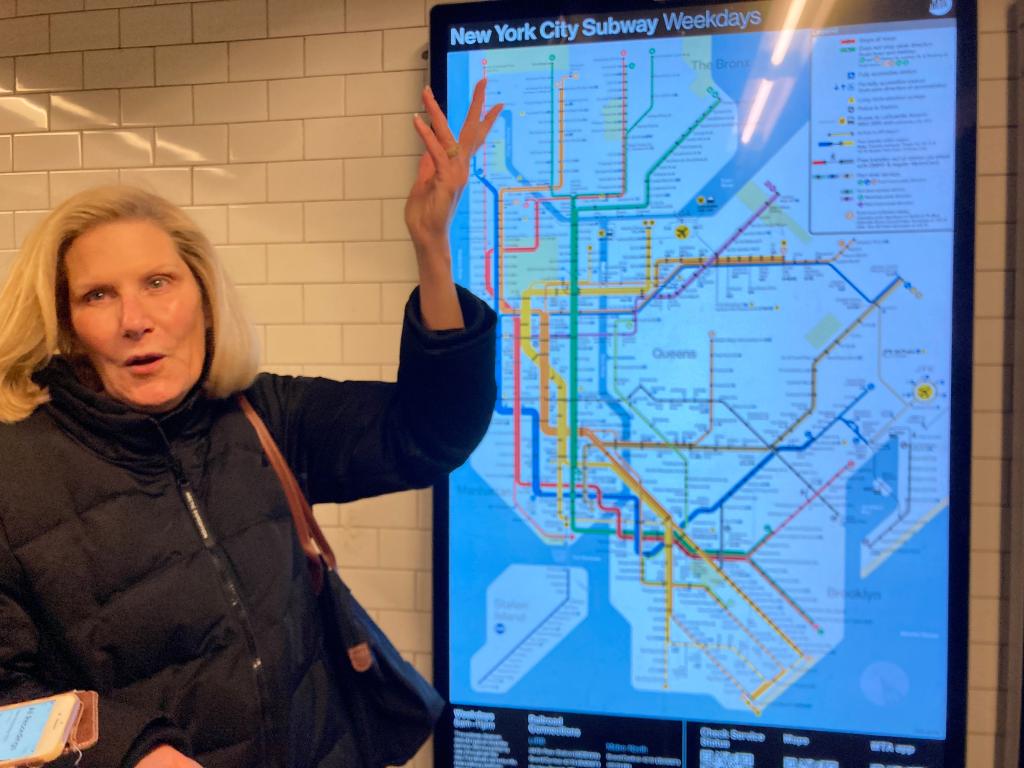
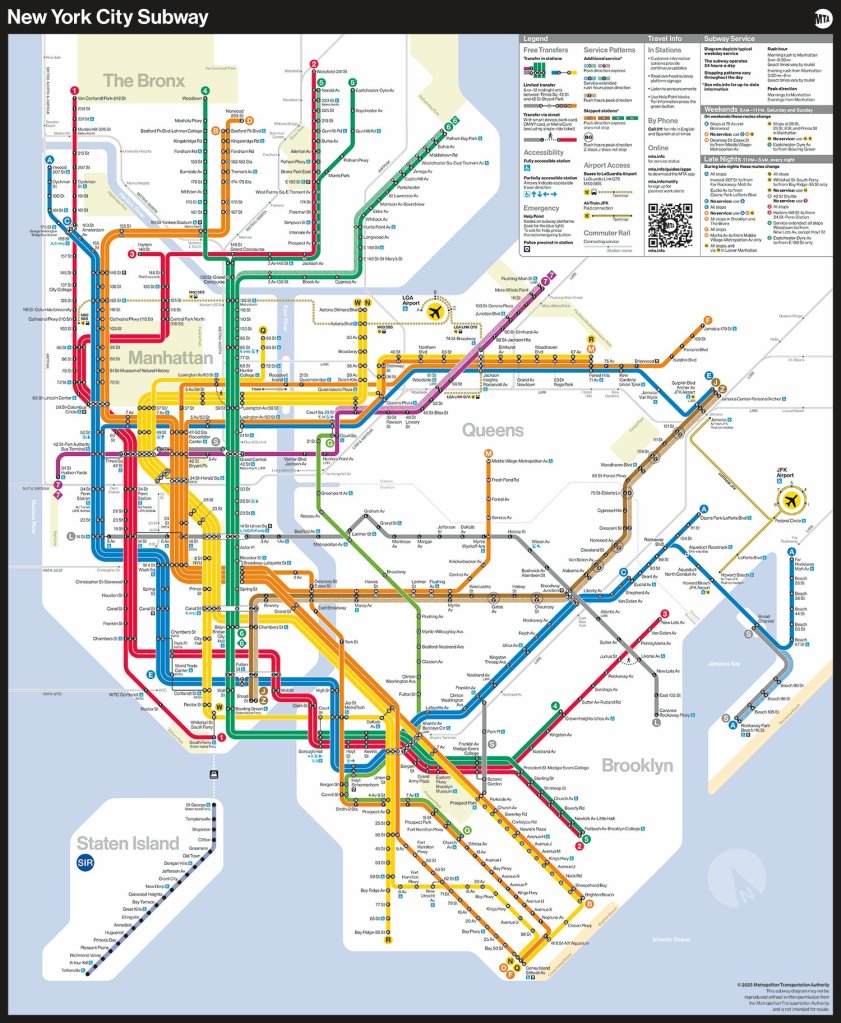
The revamped design replaced Michael Hertz’s well-known spaghetti diagram launched in 1979 with a new map featuring bright, bold lines against a white backdrop that identifies each subway route in the Big Apple, with markings specifying free out-of-station transfer hubs and accessible stations.
The new layout also changes the outlines of the boroughs into graphic shapes instead of using their topographically accurate borders seen on the old version.
“The new MTA is focused on a quality, 21st-century customer experience, and it’s about time our map caught up,�?MTA Chair and CEO Janno Lieber
“The new version is much easier to read while also reflecting all the enhancements we’ve made over the years.�?/p>
Scores of straphangers across the city didn’t realize there was a new diagram until The Post told them, and scorn was swift.
“I would prefer to see more working elevators or less homeless on the trains, or even bring some of those newer trains to all the lines,” Allison Graham, 40, said at the Astoria-Ditmars N station in Queens.

“The map update could’ve waited. There are other things that need to be prioritized.�?/p>
Michelle, another rider at the station, snarked that the redesign was “really nice … if you’re a tourist. I don’t hate it but I probably won’t ever look at it again.�?/p>
Bronx resident A.J., who was rushing to catch his train on Canal Street in Manhattan, echoed her sentiment.
“Seems like a waste of money. It’s not even for New Yorkers, New Yorkers don’t need that,�?he said.
“I hope this is not why they are raising the fare again. Is this where it goes?�?rider David R., 45, wondered at the Broadway station in Astoria.
The latest layout is reminiscent of Massimo Vignelli’s , which was retired after only seven years following concerns that it was difficult to understand and didn’t reflect the street-level geography of the city.
“It’s always funny that the MTA has been desperately trying to implement this exact map for like 50 years and nobody has ever liked it,” one X user commented on the newly unveiled design.
Straphangers familiar with Hertz’s long-standing street grid , complaining that the updated design is geographically confusing and makes subway transfers more difficult to decipher.
“Oh dear! That’s much more complicated than it needed to be!” one person commented on X. “Looking at the benefits of other metro/subway maps across the world would have been helpful.”
“The city looks distorted. This is not an improvement,” another replied to the new map.
A third person said the new graphic looked like a “video game” screen.
Many commenters questioned the cost behind the MTA’s latest move — which the agency hasn’t disclosed — and called for the restoration of the old map, which transit officials said would remain available online.
“This map sucks,” another X user said. “It uses way too much space for lines instead of making use of the redundancy of lines on shared tracks. This leads to crazy distortion of distances above ground.”

The new layout, designed by the MTA’s Creative Services Mapping Department, also features nearby Amtrak, Metro North, Long Island Rail Road and PATH system routes.
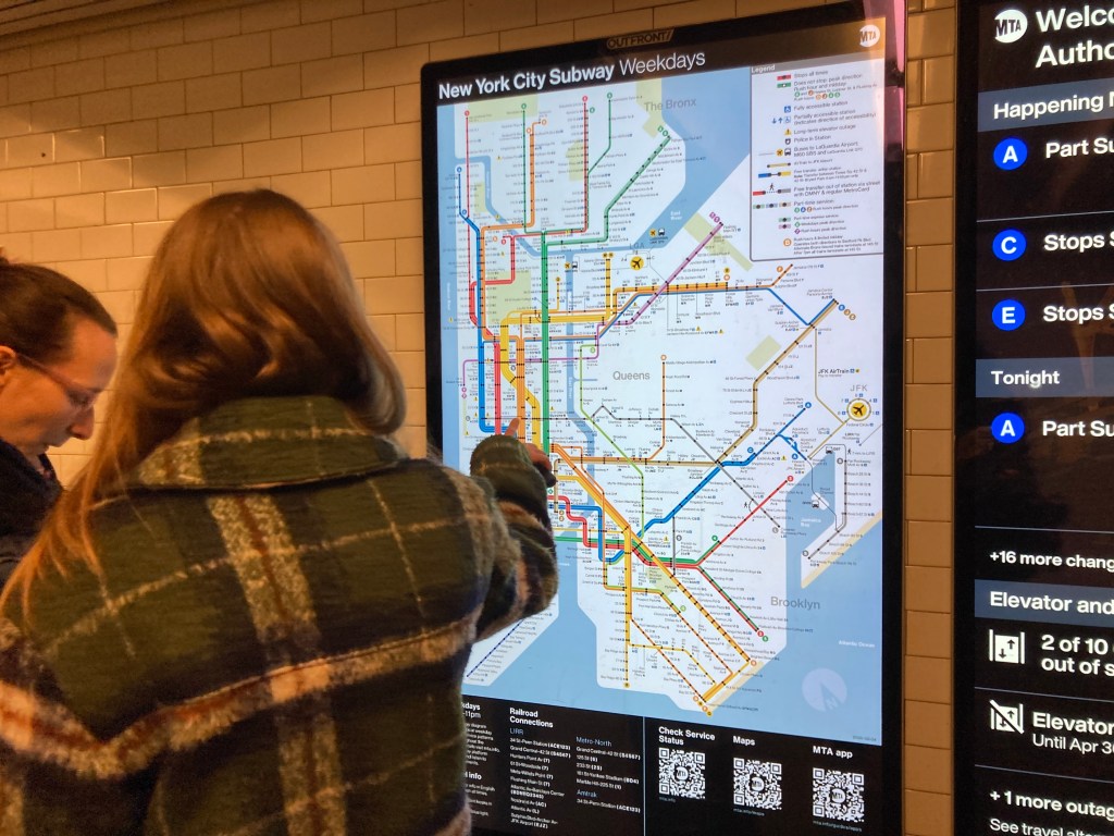
The map will be added to every train car and rail station in the coming weeks and months.
“This map rollout is utilizing the dedicated space in every subway car and the thousands of digital screens in the transit system to provide customers with detailed and up-to-date service information,�?strong> said MTA Chief Customer Officer Shanifah Rieara.
“I want to thank our customers for their input and the creative team for their years of work to update this iconic piece of the New York City Subway system.�?/p>